 vs.
vs. 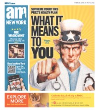
Today is one of those days when you can look across the country and ask again, “What is the purpose of a newspaper’s front page?” On the most basic level, it’s for the biggest news of the day. On a practical level, though, the front-page treatment of the Supreme Court decision on the Affordable Care Act offers a stark example of different approaches to handling the big news of the day, and at this level the front page is either for what happened yesterday or it’s for what the big event is going to mean down the road.
If you look over today’s front pages at the Newseum (note that the pages change automatically, so after Friday June 29 you’ll see different pages than I’m referring to), it’s clear that most editors took the former approach. A sample of the headlines on this theme:
Court upholds health care law
Court upholds health mandate
OBAMACARE UPHELD
HEALTH LAW STILL STANDS
Health care law stands
COURT UPHOLDS OBAMACARE
OBAMACARE LIVES
Health Law Survives
Obama’s health care law upheld
Court: Health care law passes muster
Top court upholds law
Landmark victory for health care law
Health reform survives
Health-care law upheld
UPHELD
STILL STANDING
IT’S THE LAW
THE LAW STANDS
Upheld 5-4
But this court decision did not come out Thursday night. It was shortly after 10 a.m. when it became the top item of discussion on every TV and radio news network and it exploded across the Internet. The kinds of people who buy newspapers do not live in caves. By the time the morning paper showed up, they already knew the law had been found constitutional, and they likely had heard tons of reaction and explanation.
Given all that, what purpose does the front page with headlines like those above hold? Perhaps it becomes a keepsake for them, something to file away in a box to pass on to the grandkids.
 But if one of the purposes of the front page is to entice people to read, I don’t think the headlines trumpeting what the reader already knows do that. Especially for single-copy sales, the above headlines are not going to draw the occasional reader – the people who care about news but may not subscribe.
Scattered among the day’s pages you can find a notable minority with headlines that spun the news forward to answer the question, “What does this mean for me?” especially in the context of what your particular state now has to do – even papers that took the “yesterday’s news” approach generally answered this question in story or Q&A form, but if there was a headline addressing it, it was small – and a few that focused on analysis, such as the surprise role of Chief Justice John Roberts casting the decisive vote. Those would seem to be much more promising territory for finding things that the typical person would still want more information about.
We’ve been saying for years now that newspapers are competing for attention in an environment when people are saturated with breaking news, yet at times like this it seems we struggle not to fall back on old habits. Agree or disagree?
A post at Poynter.org has a compilation of some of the day’s more notable front pages if you are late in looking for them.
7/9/12 UPDATE: Sam Kirkland, a Dow Jones News Fund copy desk intern for the Tampa Bay Times, makes a similar point in a July 6 post at Poynter.org, saying that most of the headlines on the health care ruling may serve the role of scrapbook material but they didn’t make him want to read:
“… the louder a headline shouts, the less likely I am to read the story, because a story commanding a 120-point headline likely commanded my attention yesterday, when it was fresh.”


